I Brightened 22 Wonder Woman Movie Stills So You Could Actually See Stuff
Earlier this week Warner Bros. gifted us with our first look at Gal Gadot in the Wonder Woman solo film. But as with a lot of DC movies lately, the footage was dark. I’ve attempted to correct that.
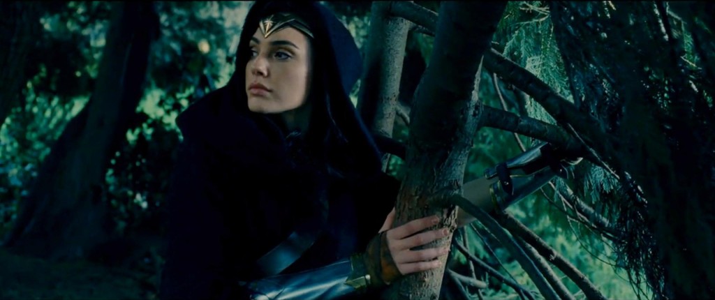
I didn’t want to mess around too much with the images so all I did was adjust the brightness with curves in Photoshop. It’s amazing what a difference it makes lightening them up even a little bit. They probably still look dark to most people but taking it any further just makes it look off.
It wasn’t difficult but a bit time consuming so please credit and link back here if you decide to use them anywhere! Without further ado…
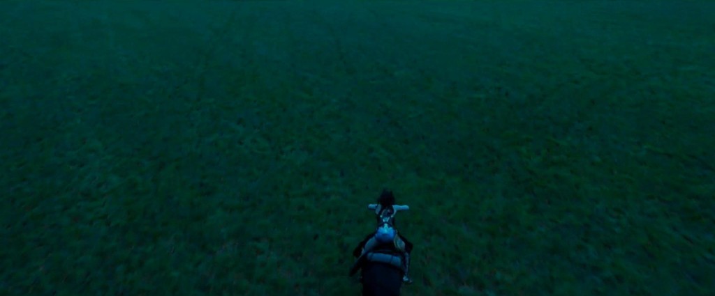
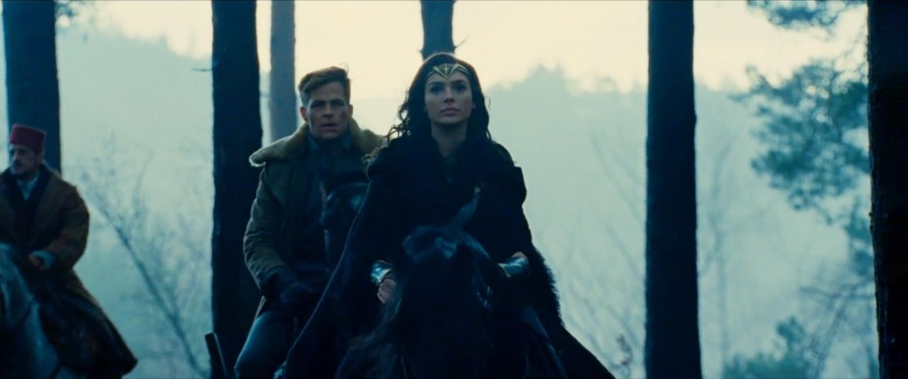
There’s some set photos going around twitter where you can get an even better look at her shield and sword. They look really awesome. And here’s a bunch of her on horseback!
QUEEN!
And here’s a look we’ve seen before.
And some more fighting.
And a good look at her tiara…
And finally, her “Clark Kent” moment.
“Damn, I look pretty good.”

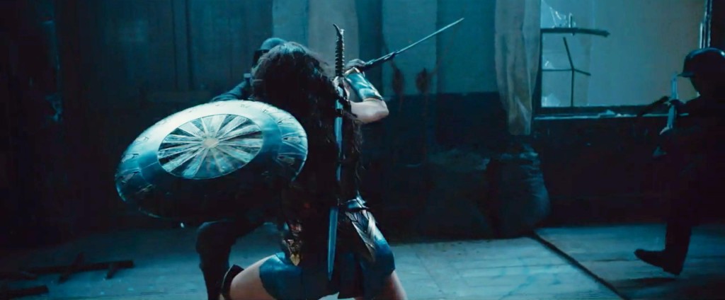
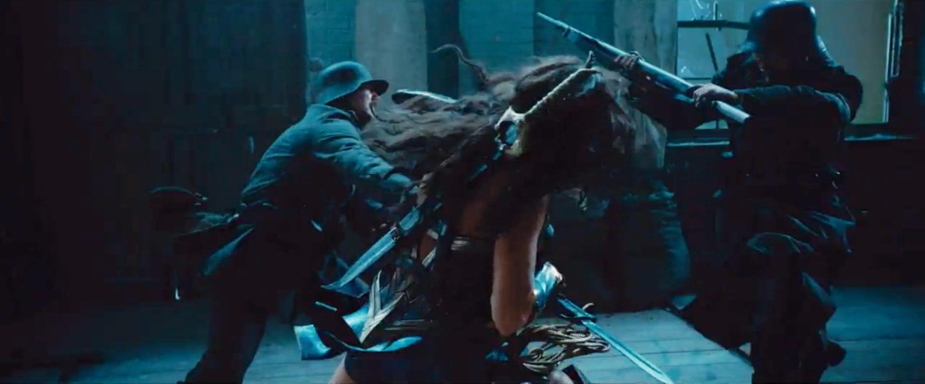
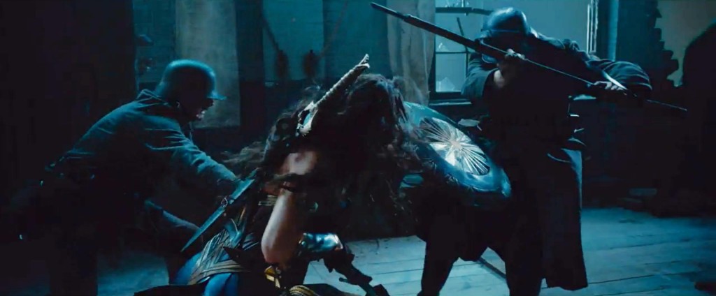
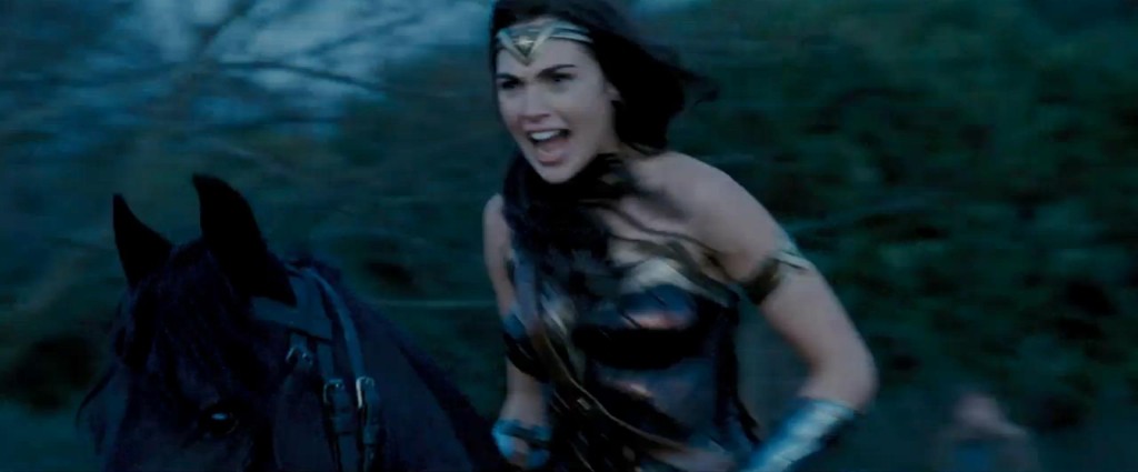
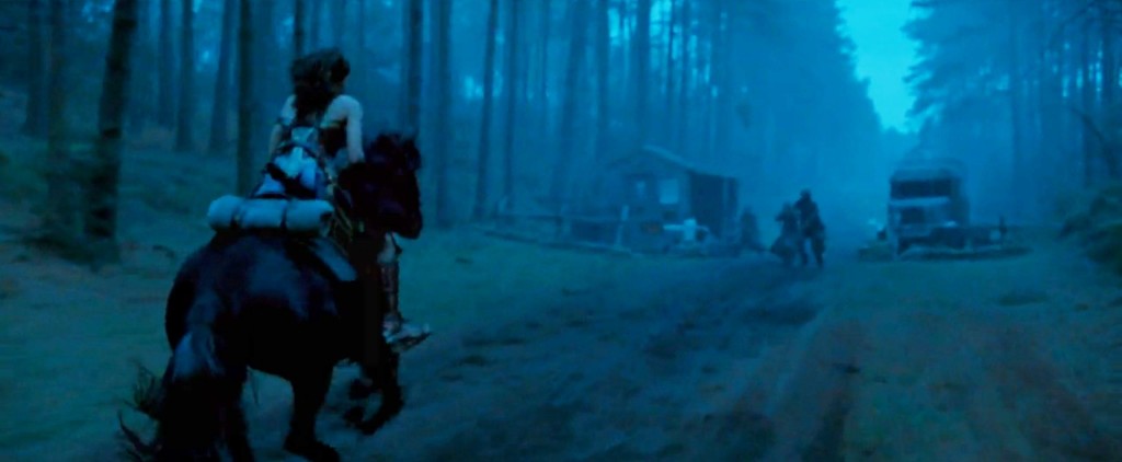
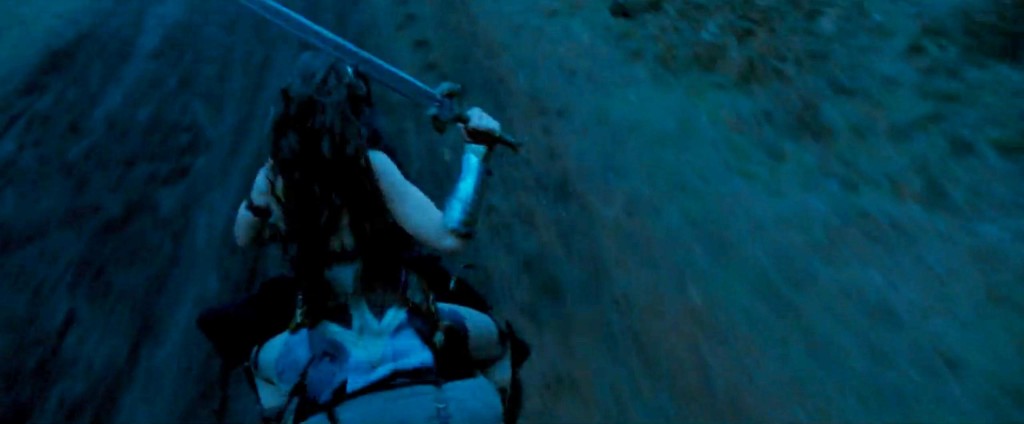
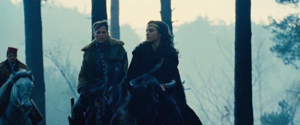
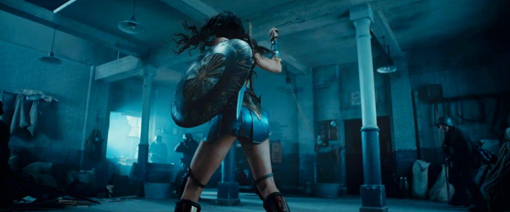
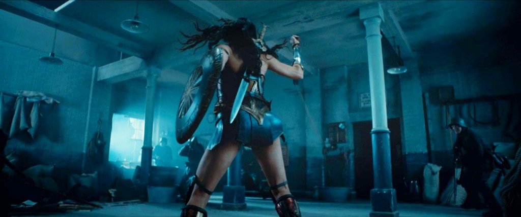

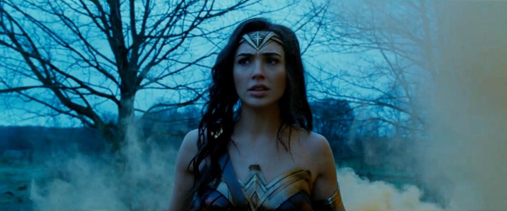
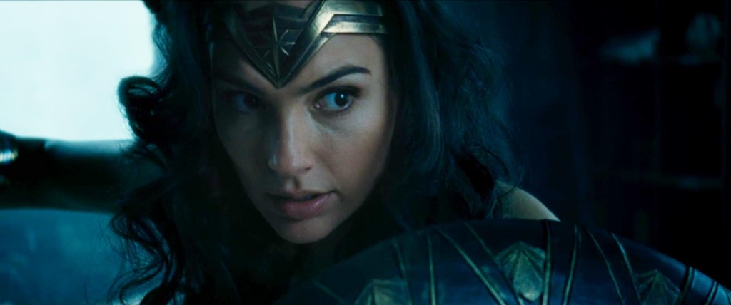
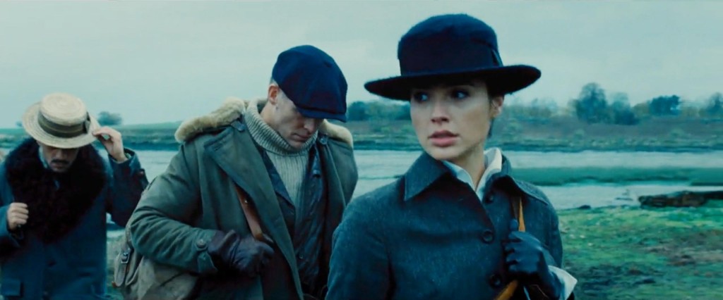
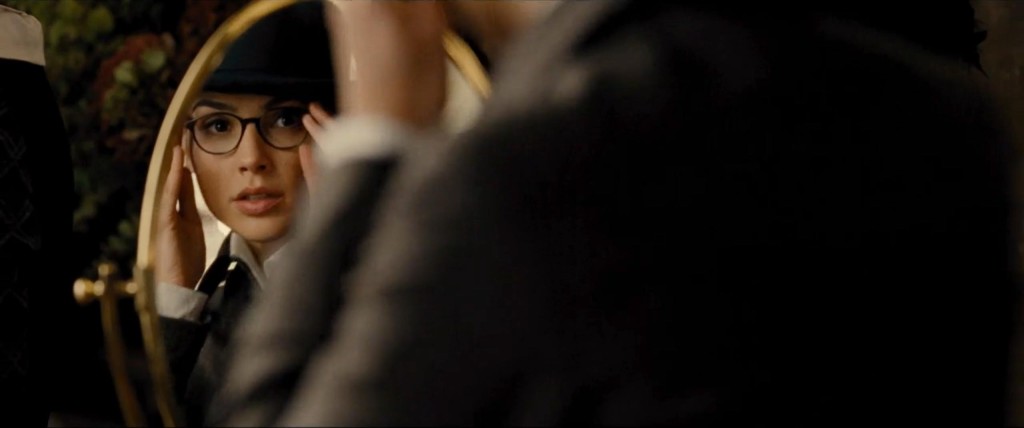
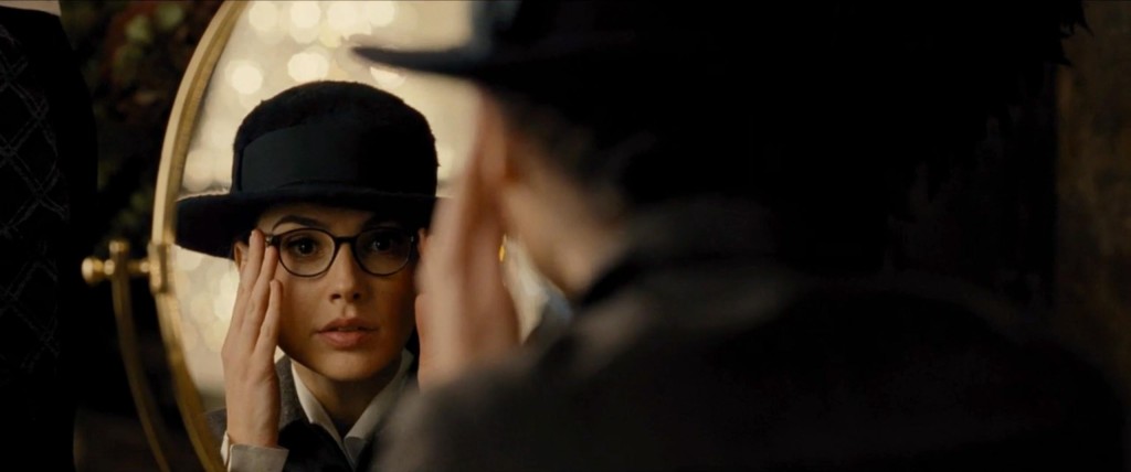

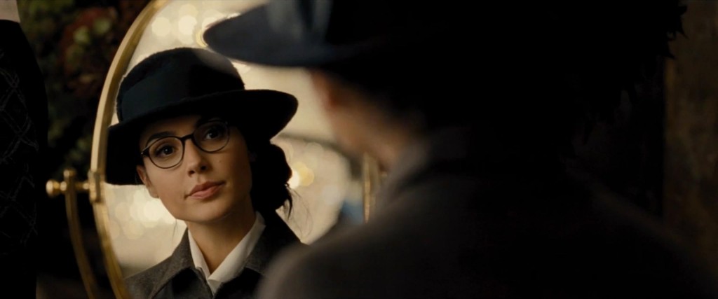
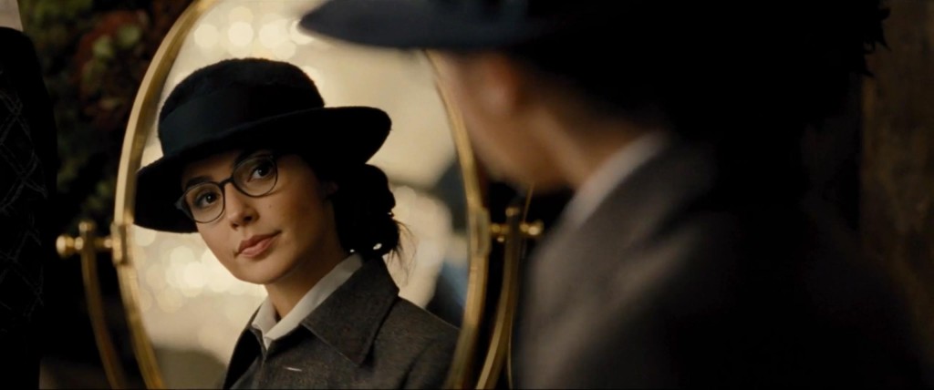
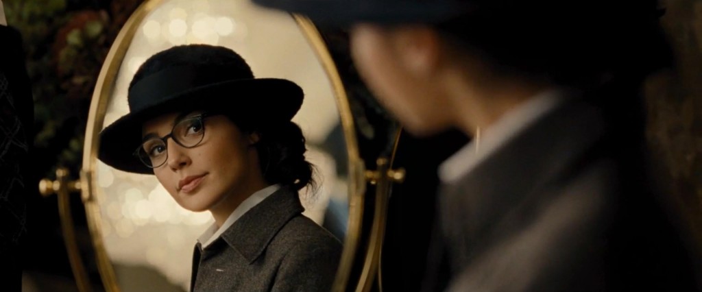
I think those low angle shots of her fighting are likely used to show her power and give her more height, but I hope they don’t continually keep the focus there. Her physique is nice, but don’t exploit her backside please studio.
things to improve … attention studio
THANK YOU for this service. I actually caught a little flak for suggesting everything was dark as hell.
i am a comment
my eyestrain thanks you for this.
The move takes place during world war 1 and it’s set during winter. I understand the color pallet they are using.
Since most of these seem to be coming from her time on Earth, I’m provisionally on board with the color palette. But Themyscira better be bright as hell!
[…] The footage was taken from the uber-dark CW broadcast, so it’s not the easiest to see. But Jill Pantozzi from The Nerdy Bird brightened up the footage to give us a better look. […]
Wait, those are the lightened pictures? Oh boy. I’m really trying to be hopeful for this movie, but they just keep making it difficult.
YUPPPP. Here’s one comparison: https://twitter.com/JillPantozzi/status/690237201343447040
Heaviest of sighs. And that’s not even going into the most aggressively blue tint I’ve yet seen in a Hollywood production. Guys, please, there are other colors too.
And now I was curious and went ahead and did some very small color edits to see what a less blue take on this looks like:
I think the people at Warner Brothers forgot what an f-stop was.